
I recently saw that Poland passed the 50000 mark on the European part of the map, which made it the first European country to do so. Go Poles!
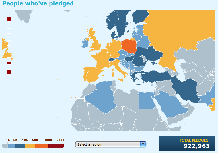
Download day map of Europe as of Sunday June 8th, 2008.png
Now, it's hard to compare countries, because of the diversity of sizes. Of course the US is leading the way, but they have a population of 300 million people and many of them are connected...
How can we compare countries on a fairer ground? This question has been on my mind for a couple of days, until Ken 'Numerator' Kovash blogged about the community-driven Download Day 2008 Statistics, which has tons of great info.
I wish we could rank countries for the download day by number of connected people. It's not (yet?) possible, but Ehsan Akhgari provides the world with Pledge Rankings by Country Population, which is pretty close to what I want.
I used the data available as of June 9 afternoon (European time), and decided to remove all data points with fewer than 500 pledges, because I (wildly) guess with less than this, the sample is too small and therefore "noise" is too significant[1].
Here are the results:
| Rank | Country | Pledge Count | Ratio (%) |
| 4 | Slovenia | 4666 | 0,232 |
| 6 | Estonia | 2694 | 0,206 |
| 7 | Iceland | 622 | 0,204 |
| 10 | Poland | 68772 | 0,179 |
| 13 | Netherlands | 22254 | 0,134 |
| 14 | Malta | 519 | 0,129 |
| 17 | Norway | 5519 | 0,119 |
| 19 | Latvia | 2562 | 0,114 |
| 20 | Lithuania | 3904 | 0,110 |
| 21 | Albania | 3853 | 0,106 |
| 22 | Belgium | 1102 | 0,106 |
| 24 | Denmark | 555 | 0,101 |
| 25 | Portugal | 10687 | 0,100 |
| 26 | Finland | 505 | 0,096 |
| 27 | Croatia | 4315 | 0,096 |
| 30 | Singapore | 3784 | 0,082 |
| 31 | Chile | 13231 | 0,080 |
| 32 | Spain | 31446 | 0,078 |
| 33 | Switzerland | 5871 | 0,077 |
| 34 | Canada | 2538 | 0,076 |
| 36 | Hungary | 7471 | 0,075 |
| 37 | France | 47378 | 0,074 |
| 38 | New Zealand | 2964 | 0,071 |
| 39 | Ireland | 2909 | 0,070 |
| 41 | Italy | 40367 | 0,069 |
| 42 | Sweden | 5677 | 0,063 |
| 43 | Bulgaria | 4417 | 0,061 |
| 45 | Austria | 4915 | 0,060 |
| 46 | Israel | 4126 | 0,058 |
| 47 | United Kingdom | 35268 | 0,058 |
| 48 | Uruguay | 1921 | 0,055 |
| 49 | Greece | 5821 | 0,054 |
| 50 | Taiwan | 11829 | 0,052 |
The conclusion is that the small countries are leading the way. Why is that? I had an Eureka moment on Friday while discussing this with a journalist in London. It suddenly came to my mind that smaller countries are more likely to adopt Firefox than Internet Explorer since Microsoft was not interested in addressing the needs of what they considered as too small and not valuable markets. And I think that, to a certain extent, because localization of an application (in this case Windows+IE) has a fixed cost that is unlikely to be recouped on a small population. With our open-source approach, where Mozilla empowers local users, the cost of covering one more locale is limited. This means that our Open-Source nature actually gives us a head-start to cover some territories... while the quality of the product - along with the word of mouth - does the rest!
Notes
[1] I totally suck at statistics, so please correct me if what I write does not make sense.


10 réactions
1 De Amsterdammer - 09/06/2008, 19:26
The only statistic I trust is the one I made by myself. So I say: leading locale (behind en-*) is Portuguese: pt-PT + pt-BR
2 De LordFarquaad - 09/06/2008, 21:18
Don't forget to multiply Belgum's count by about 10
And Denmark also lacks a digit I did not check all the list…
3 De Ehsan Akhgari - 09/06/2008, 23:06
Hey,
Do you want me to incorporate your "pruning" idea into the stats page I've created? I can create some sort of "Purified Pledge Rankings by Country Population" if you think that would be helpful.
Ehsan
4 De The Fox - 10/06/2008, 09:25
Hello Tristan,
Here again we find an illustration of the long tail you already blogged about...
Thanks
5 De Neil - 10/06/2008, 10:59
I don't know about your statistics but I'd appreciate it if you could say
6 De Dorus - 10/06/2008, 12:26
Yeah, you 'totally suck at statistics'. You made a common mistake almost everybody makes when comparing big populations to small. With a small population, you take a smaller sample. Even when you let the whole country pledge, you are still taking a sample. As you are taking a smaller sample from smaller countries, the numbers there are less accurate. Thus small countries will give a wider variation in result. Also, as there are more small countries then big countries, they also have a bigger change to be anywhere in the list. This mean there is a bigger change small countries show a extreme high participation ratio, but also more often extremely low. To get correct results, you should not only look at the top 10, but also at the bottom 10, i bet you won't find many big countries there either (at least not more then at the top). You ignored those with <500 pledges, totally wrong statistical speaking
Now, you can compensate for this using the right statistical formula's, the one you need is the Moivres equalation, ( d=d/sqrt(n) ). But i'm no statistician, so i'm not exactly sure how. Got this story from a science magazine, remembered it immediately when you mentioned small countries have higher averages, based on the fact they show up more often in the top 10.
7 De Sinklar - 10/06/2008, 13:01
Hello.
There are 11597 pledges (and counting) in Belgium, not 1102...
It is 1/4 of the total pledges from France, however the population ratio Belgium/France is 1/6.
8 De Ran - 10/06/2008, 14:20
I am missing Germany.
9 De antouane - 10/06/2008, 18:10
Go go go Belgium
I'm trying to spread the word arround me ... but a lot of people doesn't care about download and using a good browser. They even didn't know the meaning of "web browser ...".
Sad (for them ^_^)
10 De Gilles - 11/06/2008, 01:13
Devoir accompli. Allez les Bleus